

Dr. Search 1
- Doctor Discovery & Appointment Platform
Mobile-first platform to help patients quickly find and book nearby doctors with minimal friction.
Overview
Helping patients quickly find and book the right doctor nearby
Role
Lead UX Design
Platform
Android (Mobile App)
Dr. Search 1 is an Android-based platform designed to help patients discover and book doctors across nearby clinics, chambers, and hospitals.
The focus was on simplifying how users search, compare, and schedule appointments—especially in situations where time and clarity are critical.
What needed to be solved
Finding the right doctor is often more difficult than it should be - especially when users are dealing with urgency or limited information.
Patients typically rely on scattered sources, unclear availability, and incomplete details, making it hard to compare options or make confident decisions.
The challenge was to design a simple, reliable way for users to discover relevant doctors nearby and book appointments without confusion or delay.
Design approach
The experience design was guided by the PET framework from my CXA practice—Persuasion, Emotion, and Trust.
This helped shape not just usability, but how users feel, decide, and build confidence while booking healthcare services.
Persuasion
Helping users confidently choose the right doctor.
-
Verified doctor credentials
-
Patient ratings and reviews
-
Clear specialization filters
Emotion
Healthcare decisions can feel stressful. The interface needed to reduce cognitive load.
-
Calm visual design
-
Clear information hierarchy
-
Simple booking flow
Trust
Patients must trust the platform before booking appointments.
-
Transparent doctor information
-
Visible clinic details and availability
-
Consistent interaction patterns
Applying the PET framework throughout the design ensured the platform not only works efficiently, but also supports confident and informed healthcare decisions.
Design process
The design process focused on understanding user needs, simplifying decision-making, and building a seamless appointment booking experience.
01
User Research & Discovery

Initial research helped understand how patients currently search for doctors, the challenges they face, and key decision factors influencing appointment booking.

02
Paper Wireframes
Early ideas were explored through quick sketches to map user flows and validate structure before moving into digital designs.
03
Prototyping Evolution
AI-assisted design workflows were used to rapidly generate layout concepts and interaction structures. These prototypes were iteratively refined using UX best practices and usability feedback.
Low-fidelity and mid-fidelity prototypes helped validate navigation patterns, search filtering, and appointment booking flows before moving into final interface design.


04
Usability Testing

Designs were validated through usability testing to identify friction points and refine the experience for better clarity and efficiency.
05
Hi-Fidelity Product Design
After iterative prototyping and usability validation, the design evolved into a high-fidelity production-ready interface. AI-assisted workflows accelerated design exploration while UX expertise ensured clarity, trust, and efficient doctor discovery.

In addition to the patient-facing mobile app, I also designed the complete administrative platform used to manage doctors, chambers, and appointments.
06
Admin Platform – Managing the Doctor Network
The platform also includes an administrative dashboard used to manage doctors, clinic locations, and appointments. This ensures accurate doctor availability and smooth operations for the healthcare network.

Admin Login
Secure admin authentication allows platform managers to access the system and manage doctor profiles, chambers, and appointments.
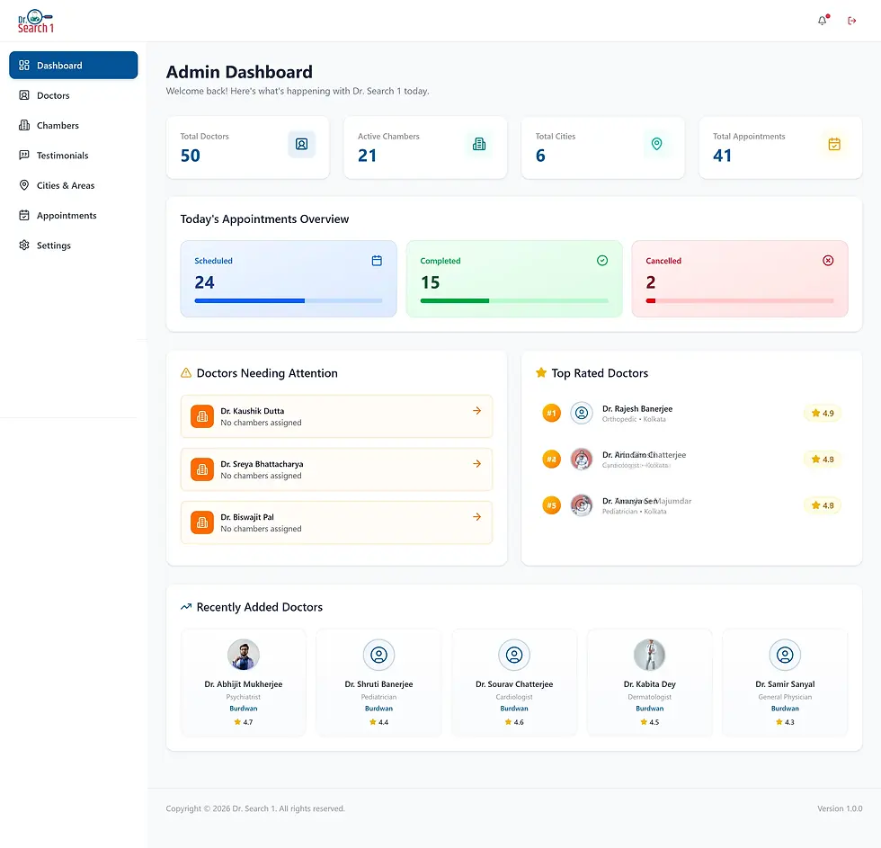
Admin Dashboard
The dashboard provides a quick overview of doctors, chambers, appointments, and platform activity, helping administrators monitor operations in real time.

Doctor Management
Admins can add doctors, update profiles, assign chambers, and manage consultation schedules to keep doctor availability accurate for patients.
System Architecture
& Product Ecosystem

The platform was designed as a connected healthcare ecosystem. Patients interact with the mobile application to discover doctors, compare profiles, and book appointments through a structured search and booking engine. On the operational side, administrators manage doctor profiles, chamber schedules, and appointment availability through a centralized web dashboard, ensuring accurate real-time information across the entire platform.
Key UX Improvements & Impact
Key UX improvements focused on reducing friction, improving clarity, and helping users make faster, more confident decisions while searching and booking doctors.
Problem
Patients struggled to compare doctors due to scattered and inconsistent information.
The booking flow was confusing and lacked clear steps or progress visibility.
Doctor availability was unclear, often requiring users to call clinics for confirmation.
Design Intervention
Structured doctor profile cards were introduced, highlighting specialization, experience, ratings, and availability in a clear format.
A step-based booking flow was designed with clear stages—doctor selection, time slot selection, and confirmation.
Real-time schedule visibility was integrated directly within doctor profiles.
Outcome
Improved scannability and faster comparison during search.
Reduced booking friction and improved task completion.
Users could instantly view available slots, improving booking confidence.
Outcomes & Product Impact
The redesigned experience streamlined doctor discovery, simplified appointment booking, and created a more scalable healthcare management workflow.
Improved Discovery
Clear doctor profiles and structured filters helped users find relevant doctors faster.
Simplified Booking
Step-based appointment workflows reduced confusion and improved booking completion.
Operational Scalability
The admin platform enabled easier management of doctors, schedules, chambers, and appointments.
Better User Confidence
Improved information hierarchy and transparency created a more trustworthy booking experience.
Key Learnings
Designing for clarity improves trust
Clear information hierarchy and guided workflows helped simplify healthcare decision-making.
Research shapes better experiences
User research and usability insights played a key role in reducing friction throughout the booking journey.
Scalable systems matter
Designing both patient and admin experiences required consistent interaction patterns and structured information architecture.
Thanks for taking the time to explore this work